Paint feels harmless because it’s easy to change, but buyers don’t always see it that way. Color sets expectations before anyone notices square footage, light, or layout, and the wrong choice can pull attention in the wrong direction. Some colors don’t just divide taste—they make people hesitate, question upkeep, or mentally start subtracting money. These are the shades that consistently work against a home, even when the rest of it checks out.
1. Dark Red And Burgundy Walls
Deep reds tend to feel heavy once they’re spread across full rooms. What looks dramatic in a dining room photo often feels enclosed in person, especially in spaces without a lot of natural light. Buyers notice how quickly the color dominates the room; their attention shifts to how much work it will take to neutralize it.
The issue isn’t that red is “bad,” but that it’s hard to ignore. Furniture choices feel limited, and rooms start to feel smaller than they are. Many buyers mentally price in repainting before they’ve even walked through the rest of the house.
2. Bright Yellow Kitchens
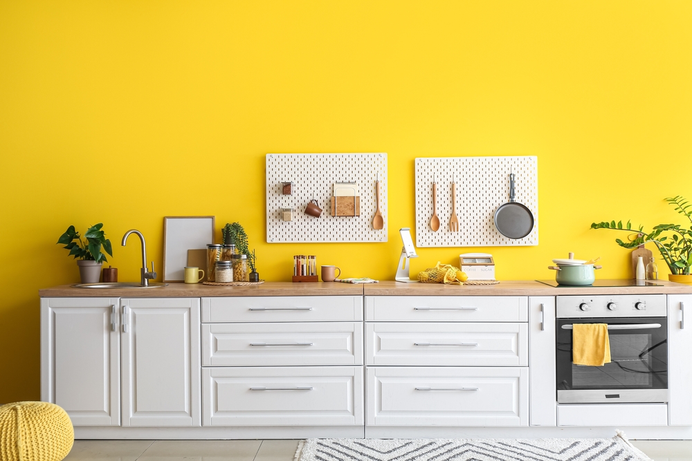
Yellow kitchens were popular for a while because they felt cheerful and energetic. According to buyer preference surveys cited by Zillow and resale data referenced by Consumer Reports, bold yellow kitchens consistently rank low with buyers. The color tends to overwhelm the space rather than warm it. Lighting can make it harsher than intended.
Buyers often react viscerally to yellow, especially in kitchens where they expect calm and cleanliness. Even when cabinets and counters are updated, the color draws focus away from those improvements. People start thinking about paint supplies instead of storage or layout.
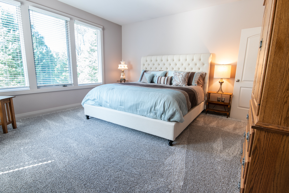
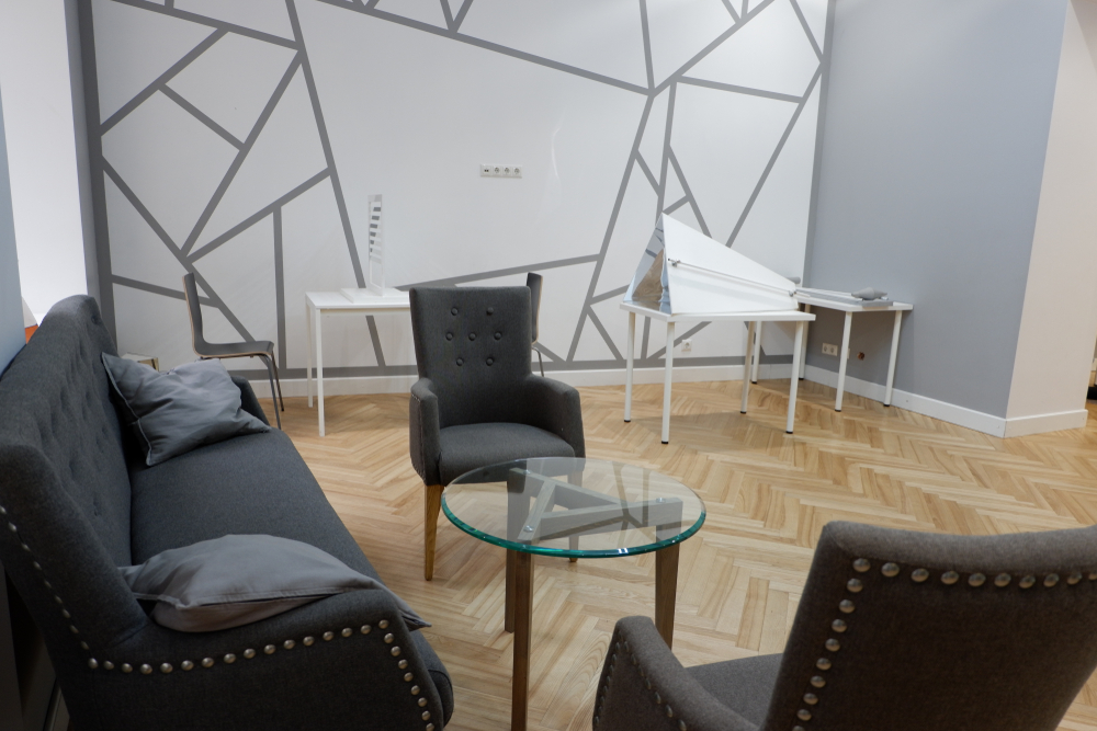
3. Charcoal Or Almost-Black Bedrooms
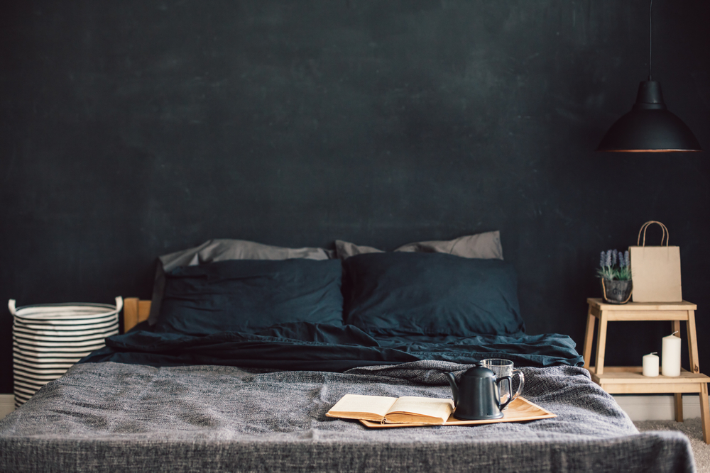
Dark bedrooms are painted with coziness in mind, but they don’t always land that way. Heavy colors absorb light and make rooms feel tighter, even when the square footage is decent. Buyers imagine waking up there and feeling less energized than they expect to.
What makes this color tricky is how personal it feels. Some people love it, but many don’t want to inherit someone else’s version of comfort. The room stops feeling neutral and starts feeling like something to undo.
4. Lavender And Pale Purple Rooms
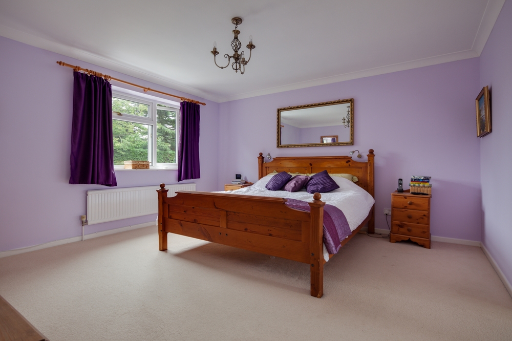
Light purple tones tend to read as dated or overly specific to buyers. According to home staging research cited by the National Association of Realtors and buyer response data reported by HGTV, purple consistently ranks among the least appealing interior colors. Even softer versions tend to polarize. Buyers struggle to imagine their own furniture in the space.
Purple also photographs unpredictably, which can hurt listings before showings even happen. The color shifts depending on light and time of day. That inconsistency makes buyers uneasy.
5. Teal And Blue-Green Accent Walls
Teal and blue-green shades often get chosen because they feel bold without being as risky as brighter colors. In practice, they tend to dominate whatever room they’re in, especially when used as an accent wall. Buyers focus on the color choice rather than the room itself. The wall becomes the main takeaway.
It just feels so…specific. Even people who don’t dislike it personally struggle to picture it with their own furniture. The room starts to feel like someone else’s decision.
6. Hunter Green Living Rooms
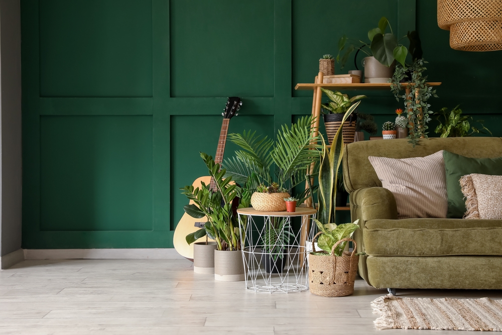
Hunter green has made a comeback in design magazines, but it doesn’t always translate well in real homes. According to buyer preference data cited by Zillow and market analysis referenced by Real Simple, darker greens tend to test poorly in main living spaces. They absorb light and can make rooms feel heavier than buyers expect. That reaction happens even in well-lit homes.
Living rooms carry a lot of pressure during showings. Buyers want them to feel open and flexible, not stylized. When the color sets a strong mood, people spend more time evaluating it than the space itself.
7. Navy Blue Bathrooms
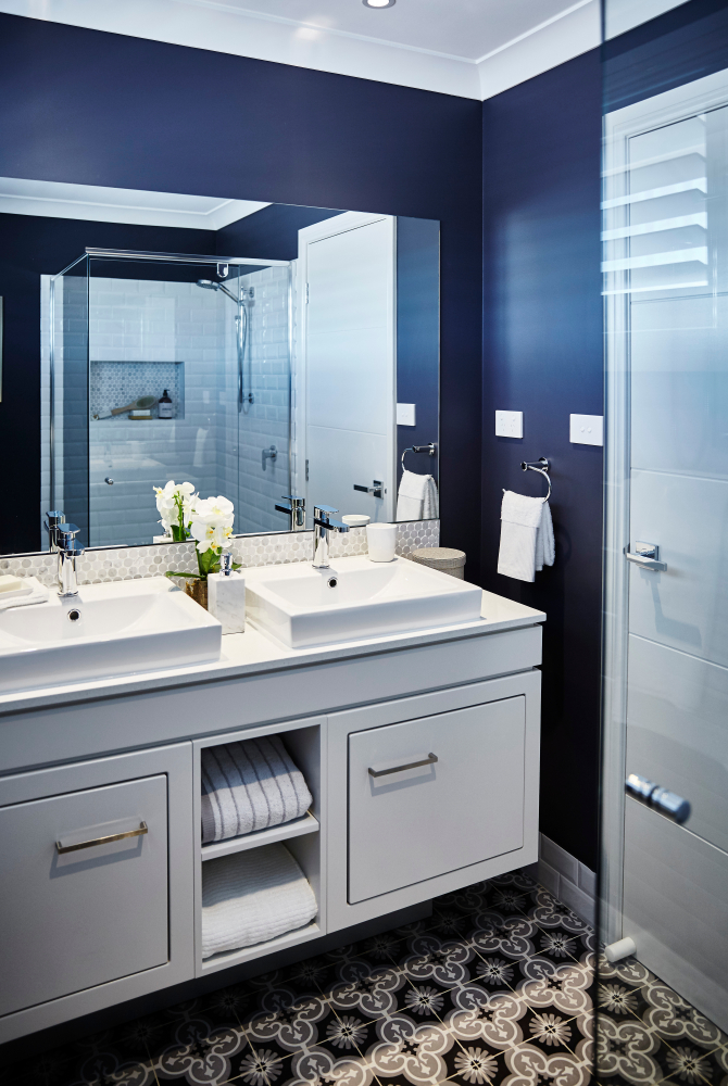
Navy bathrooms often look polished online, especially in staged photos. According to homebuyer behavior research cited by the National Association of Realtors and resale studies reported by Apartment Therapy, dark bathrooms tend to reduce perceived cleanliness and size. Buyers expect bathrooms to feel bright and simple. Navy works against that.
As always, lighting plays a big role here. Without perfect light, navy can feel flat or shadowy. Buyers notice how quickly the room feels closed in. The color becomes a distraction rather than a feature.
8. Orange Or Terracotta Interiors
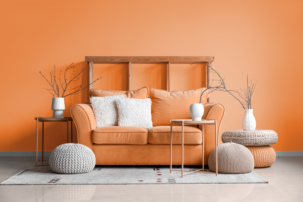
Orange and terracotta shades are chosen for warmth, but they can overpower a room fast. In interior spaces, they tend to reflect light unevenly and exaggerate shadows. Buyers associate them with dated trends. That association can stick even if the rest of the home feels current.
These colors are also hard to soften with decor. Rugs, furniture, and art don’t neutralize them easily.
9. High-Gloss Or Shiny Paint Finishes
Glossy finishes draw attention to every wall imperfection. Dents, seams, and uneven textures become more visible, especially in older homes. Buyers notice flaws faster because the light bounces directly off the surface. The walls are less forgiving.
Even when the color itself is neutral, the finish creates tension. People wonder what’s being hidden or why the walls look so reflective.
10. Bright White In Low-Light Rooms
Bright white seems like the safest option, but in rooms without strong natural light, it can fall flat. Instead of feeling clean, the color often looks cold or gray. Buyers notice how the room feels unfinished rather than fresh. The light works against the paint instead of with it.
In these spaces, white highlights shadows and uneven lighting. Walls feel stark instead of open. People start imagining warmer alternatives before they think about furniture placement.
11. Gray With Blue Or Purple Undertones
Gray became popular because it felt neutral, but not all grays behave the same way. Blue or purple undertones can show up unexpectedly, depending on light and time of day. Buyers often notice the color shift even if they can’t name it. The room just feels slightly off.
That uncertainty makes people hesitate. They wonder how the color will look at different times or with different furnishings. What was meant to be neutral becomes something they’d have to correct.
12. Pink Bedrooms Or Living Spaces
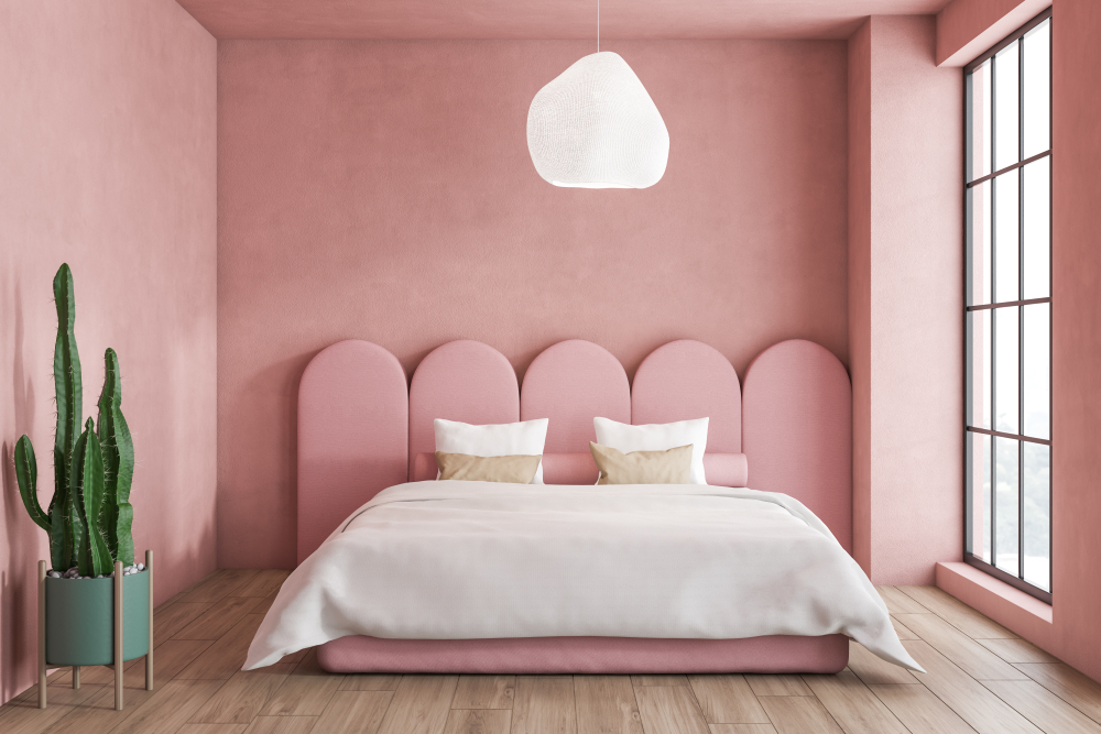
Pink can work in small doses, but full rooms tend to feel personal very quickly. Even softer blush tones carry a strong association. That association is hard to ignore.
People start thinking about repainting as part of the move-in process. The color distracts from the room’s size and layout. Attention shifts away from the space itself.
13. Beige With Heavy Yellow Undertones
Beige seems neutral, but versions with strong yellow undertones can make rooms feel dated. Under certain lighting, walls take on a dull or dingy cast. Buyers associate the color with older homes that haven’t been updated.
Even clean, well-kept rooms can feel tired because of it. Buyers notice the color before noticing upgrades. The paint sets a tone that’s hard to shake.
14. Bold Accent Colors In Open Floor Plans
Open layouts make color choices more visible. A bold accent in one area often bleeds visually into others. Buyers find it harder to separate rooms in their minds. The space feels less cohesive.
What works in a closed room can feel overwhelming when everything connects. People imagine repainting more square footage than they expected. The scale of the project feels larger.
15. Murals Or Highly Personalized Designs
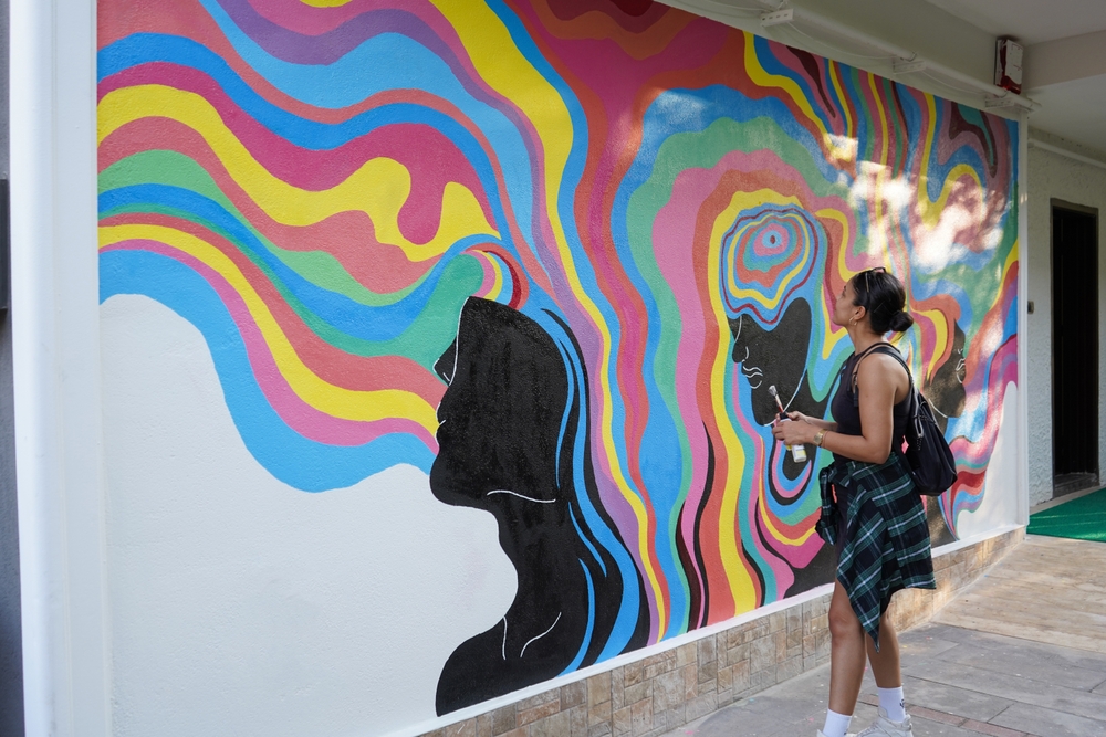
Murals and custom designs often reflect a lot of care and creativity. For buyers, they introduce another layer of decision-making. People have trouble picturing themselves living with someone else’s design choices. The space feels spoken for.
Even when the artwork is well done, it becomes a hurdle. Buyers think about removal, repair, and repainting. The room stops feeling neutral.
This article is for informational purposes only and should not be construed as financial advice. Consult a financial professional before making investment or other financial decisions. The author and publisher make no warranties of any kind.